
Seeing the (Random) Forest for the Trees
One of my research studies uses a random forest algorithm to predict continuous biomechanical variables. If you don’t know anything about random forestes, I’ll try to describe them in a sentence: They are a type of algorithm that aggregates a large number of predictions made by decision trees and produces a single prediction for the whole forest. Specifically, I am using a Quantile Regression Forest (QRF) in R using the caret and quantregForest package.
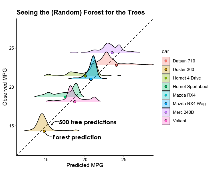
When I was assessing the accuracy of my QRF model, I wanted to visualize the variability in the individual tree predictions alongside the aggregated prediction (seeing the forest for the trees, so to speak). After looking around online, I couldn’t find any examples of someone doing this, so I thought I’d do a quick write-up on how I was able to accomplish this (plot at the bottom). Maybe it will be beneficial to someone wanting to better visualize what is going on inside the “black box” of this machine learning algorithm. For this example, I’ll use the mtcars dataset to try and predict a car’s MPG. Jump to the bottom for the link to the whole R script.
library(tidyr)
library(caret)
library(quantregForest)
library(ggplot2)
library(ggridges)

# head(mtcars)
qrf<- train(mpg ~ cyl + disp + hp + drat + wt, data = mtcars, method = 'qrf')  # train QRF model
We can then make predictions using predict(). However, this function will not provide predictions for each QRF tree (500 of them in this case) by default. We need to change the class of the finalModel to only ‘randomForest’. This provides predictions for the forest (aggregate) and the trees (individual):
n_cars = 8
class(qrf$finalModel)
## [1] "quantregForest" "randomForest"
class(qrf$finalModel) <- 'randomForest'
pred <- predict(qrf$finalModel, mtcars[1:n_cars,], predict.all = T)
str(pred)
## List of 2
##  $ aggregate : Named num [1:8] 20.9 20.9 23.9 20.1 17.5 ...
##   ..- attr(*, "names")= chr [1:8] "Mazda RX4" "Mazda RX4 Wag" "Datsun 710" "Hornet 4 Drive" ...
##  $ individual: num [1:8, 1:500] 21.2 21.2 21.8 21.2 16.5 ...
##   ..- attr(*, "dimnames")=List of 2
##   .. ..$ : chr [1:8] "Mazda RX4" "Mazda RX4 Wag" "Datsun 710" "Hornet 4 Drive" ...
##   .. ..$ : NULL
I chose to visualize the tree predictions with ridgeplots in a predicted vs observed plot. The format of pred isn’t exactly ggplot-friendly, so we need to do some reshaping with tidyr, aggregate, and merge before plotting:
# reshape individual tree predictions for ggplot
obs <- mtcars$mpg[1:n_cars]
car <- row.names(mtcars)[1:n_cars]
tree_pred <- as.data.frame(pred$individual)
colnames(tree_pred) <- 1:500
tree_pred$obs <- obs
tree_pred$car <- car
tree_pred_long <- gather(tree_pred, tree, pred, 1:500)

# reshape aggregate predictions for ggplot
agg <- aggregate(pred ~ obs + car, data = tree_pred_long, FUN = mean)  # same as pred$aggregate values
colnames(agg) <- c('obs', 'car', 'mean_pred')
pred_obs <- data.frame(pred = pred$aggregate, obs = obs)
pred_obs <- merge(pred_obs, agg, by = 'obs')

# plot distribution of tree predictions and aggregate prediction of final QRF model
ggplot(tree_pred_long) +
  geom_abline(slope = 1, intercept = 0, lty = 2)+  # line of identity
  geom_density_ridges(aes(x = pred, y = obs, group = car, fill = car),
                      alpha = 0.3, color = 'black', rel_min_height = 0.02, size = 0.5)+
  geom_point(data = pred_obs, aes(x = pred, y = obs, fill = car), pch = 21, size = 2)+
  theme_classic()+
  ggtitle('Seeing the (Random) Forest for the Trees')+
  coord_fixed(xlim = c(12,28), ylim = c(12,28))+
  scale_y_continuous('Observed MPG', breaks = seq(15,30,5))+
  scale_x_continuous('Predicted MPG', breaks = seq(15,30,5))
## Picking joint bandwidth of 0.276
Conclusion
I’ve annotated the figure above to highlight the tree vs forest predictions. The ridgeplots don’t adhere to the units of the y axis and show us the relative distribution of the individual predictions that make up the quantile regression forest. It’s kinda neat to see how the tree predictions compare to the final aggregated prediction!
Example Script
A gist of the R script can be found here
Tips and Tricks
This type of plot can get messy when many predictions are made within a small range of values, but adjusting the opacity (
alpha) can help, or you can just plot a random subset of your predictions to get a general idea.You might notice that the ridgeplots are not entirely continuous (e.g. Merc 240D). This is aesthetics and you can adjust the threshold of what to show with the
rel_min_heightparameter.If you have categorical variables in your QRF, you will need to change them to numerical before using
predict(). I guess when you use caret’strain()with the formal-style input, it puts in dummy variables for categorical. This can be fixed using theas.numeric()function.If you have an interaction in your model, I think you will need to have a column that represents that interaction before using
predict(). That’s my best guess as it throws an error about regression equation variables not being present in the new dataset you’re testing on.